
Internal App Makeover
Restructuring Onboard’s internal app to lay the foundation for evolving business needs.
Team
Product Manager, UX Designer
Role
UX Designer
Project Length
15 months
The current internal app is bloated, has hidden content making it a stressful user experience, and will not support new business needs or replatforming changes.
What’s in Admin and how should it be organized?
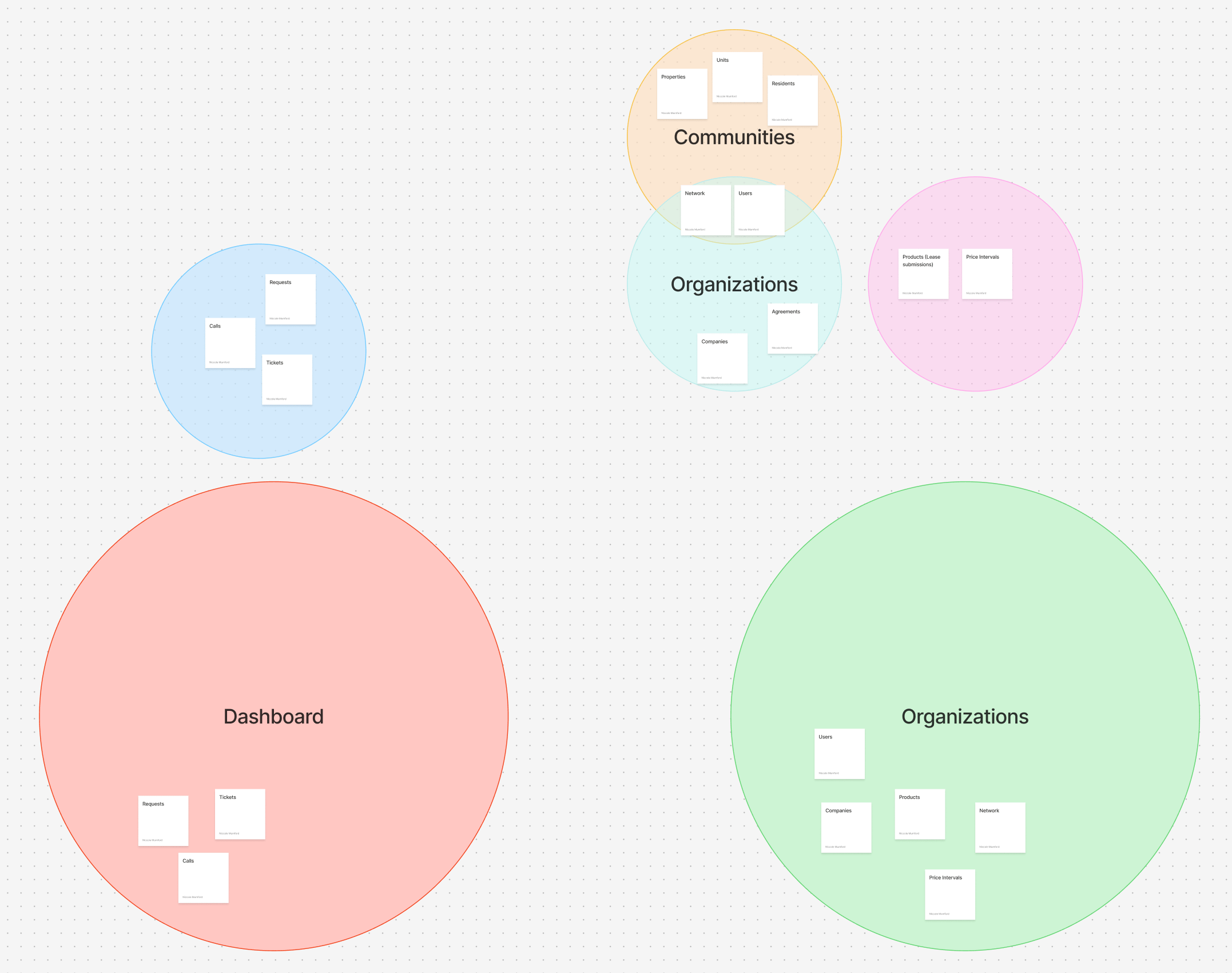
To begin, I needed to understand all of the content and information in our Admin app. To do this, I conducted a ux audit of the current admin app to understand it’s content and how information was being organized. I completed a site mapping activity. This helped me understand all of the content that I would need to account for in the redesigned app. This also helped me understand how the different information was related to each other in order to architect the future design.
Site map of Onboard’s internal app, ‘Admin’.
After my audit of the current site, I had a better grasp on all of the information in Admin. I mapped out how information might be organized in the redesigned site.
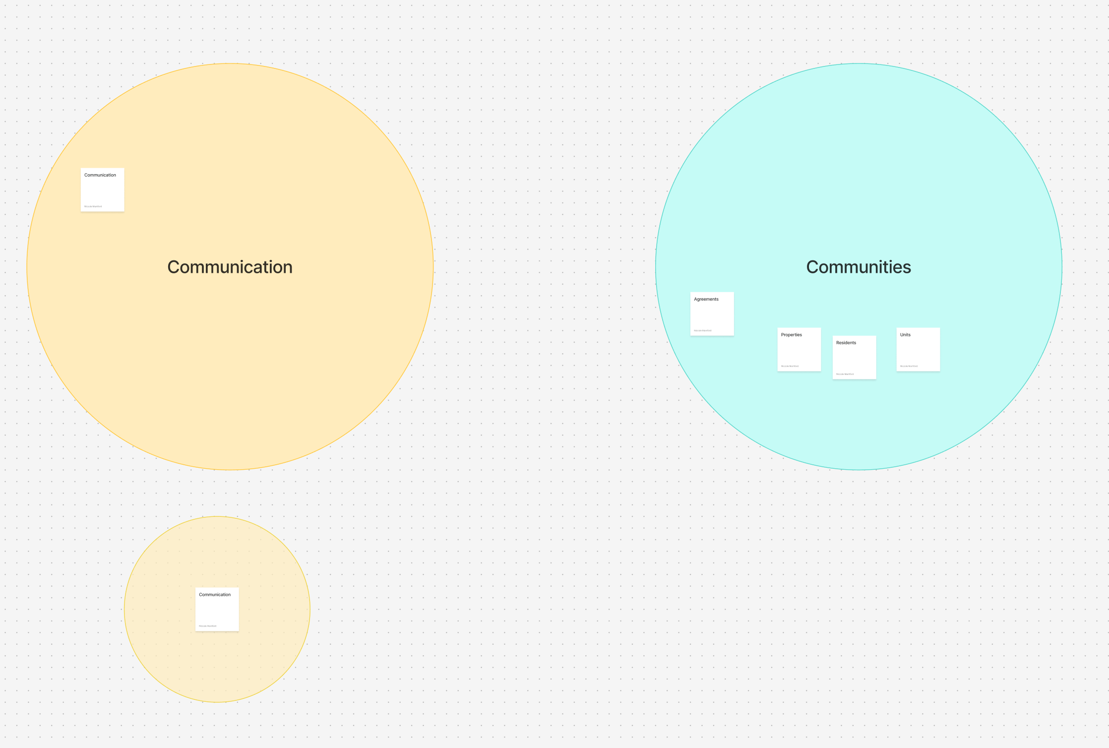
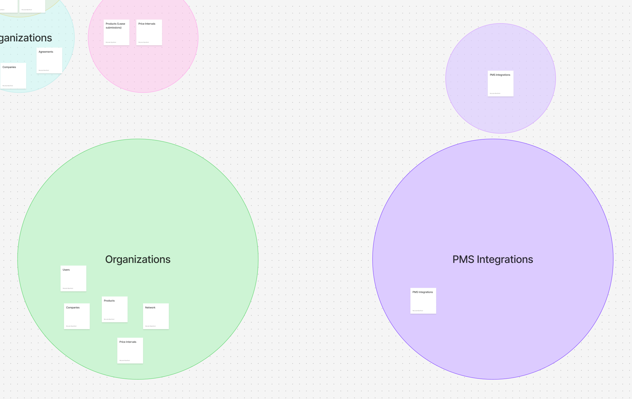
Diagramming the future architecture of the app.
Modernizing Admin
Once I had an idea of how the content would be architected, I began wireframing the new app. One limitation of this project was that replatforming was only beginning. So we would be building a redesigned app but it would need to first exist as a skeleton until the existing content could be rewritten and moved over. For my job, that meant designing a simple experience while leaving room to grow in the future.
Early wireframes for the future ‘Admin’ app.
Will this work?
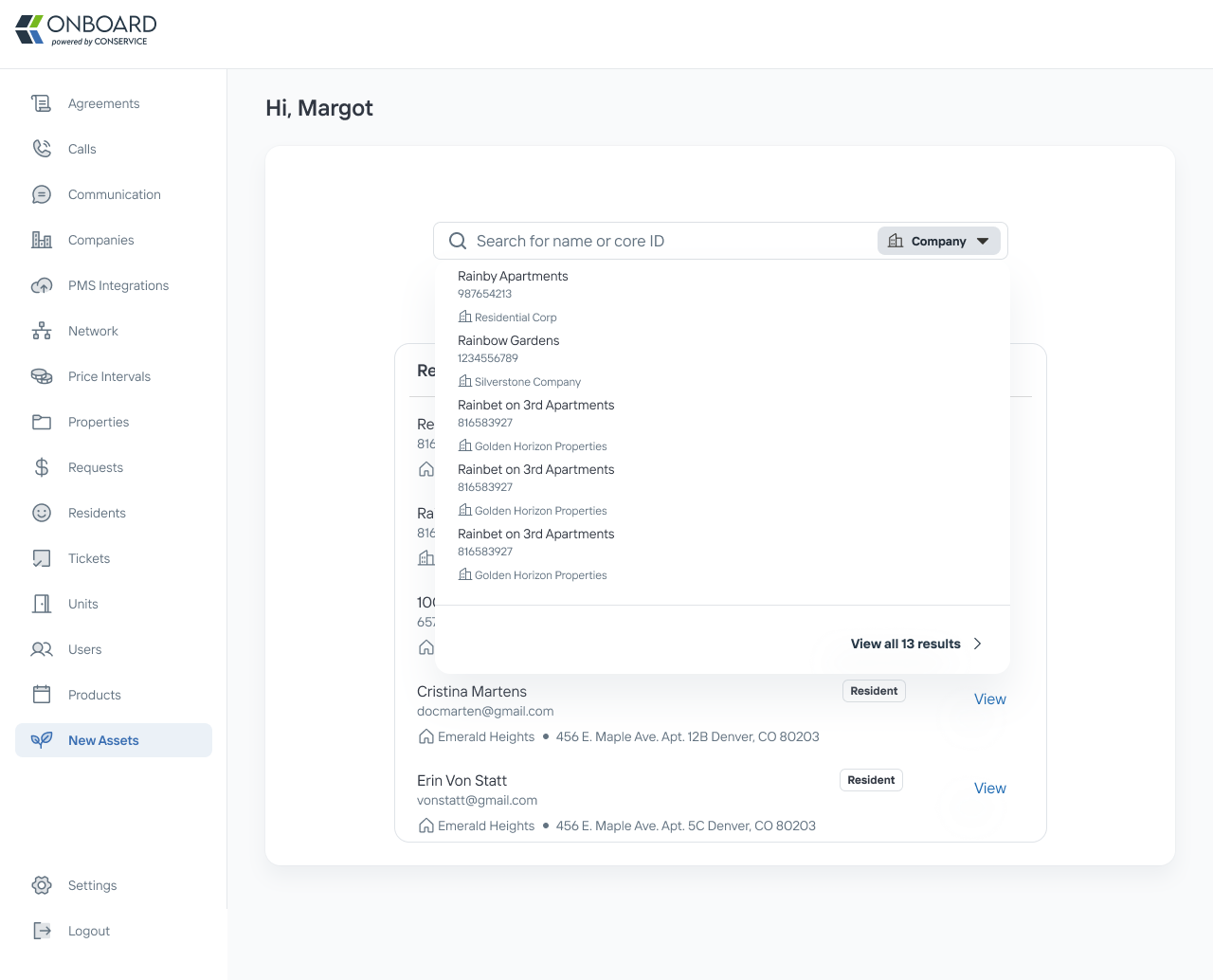
Because Admin contains so much information, part of the Admin redesign included a revamped global search to help users quickly access the information they need to do their jobs. The current global search was slow and didn’t provide the best context for users. To improve performance we wanted to partially limit the search by requiring the user to determine what asset they were searching by. So to insure that this experience would be intuitive, we tested the designs with internal users.
Item Selection
When tested, participants felt fairly confident selecting what item to search bar. Even though the participants misclicked while exploring, they did complete the task quickly.
Participants test results for switching item selection
Testing participant sentiment


Testing the ‘View all search results’
Participants also felt confident navigating to the full search results page.
Participants test results for viewing all search results
Testing participant sentiment
Laying the Foundation for the Future
While the new experience doesn’t include all that it will in the future, the experience that it offers is intuitive for users. The content is structured in a way that’s easy for users to follow. Pertinent information is at their finger tips and information used less often is neatly tucked away. It’s global search feature got a big upgrade; improving search times from 13 seconds to just 800 milliseconds to see results. It’s interface is sleek and modern. And it’s laying the foundation for much more to come in the future.
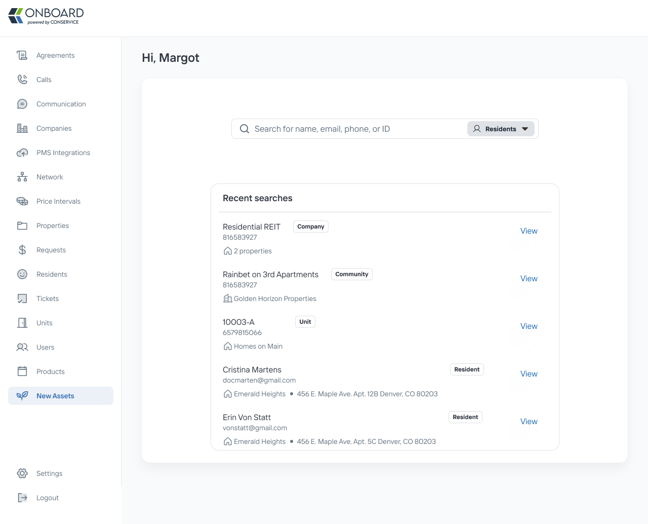
Added a recent search section so users can quickly refer back to recent searches.
Added additional details in the search results dropdown based on user test feedback.


Freeing Up the Operation Team’s Schedule
Complex Systems
Collaboration
Conservice

Previous
Making Something Out of Some Things
Design Systems
Leadership
Conservice
Next

Niccole Mumford
Milwaukee + Remote Designer
Work
About
Niccole Mumford
Internal App Makeover
Restructuring Onboard’s internal app to lay the foundation for evolving business needs.
Team
Product Manager, UX Designer
Role
UX Designer
Project Length
15 months
The current internal app is bloated, has hidden content making it a stressful user experience, and will not support new business needs or replatforming changes.
What’s in Admin and how should it be organized?
To begin, I needed to understand all of the content and information in our Admin app. To do this, I conducted a ux audit of the current admin app to understand it’s content and how information was being organized. I completed a site mapping activity. This helped me understand all of the content that I would need to account for in the redesigned app. This also helped me understand how the different information was related to each other in order to architect the future design.
Site map of Onboard’s internal app, ‘Admin’.
After my audit of the current site, I had a better grasp on all of the information in Admin. I mapped out how information might be organized in the redesigned site.
Diagramming the future architecture of the app.
Modernizing Admin
Once I had an idea of how the content would be architected, I began wireframing the new app. One limitation of this project was that replatforming was only beginning. So we would be building a redesigned app but it would need to first exist as a skeleton until the existing content could be rewritten and moved over. For my job, that meant designing a simple experience while leaving room to grow in the future.
Early wireframes for the future ‘Admin’ app.
Will this work?
Because Admin contains so much information, part of the Admin redesign included a revamped global search to help users quickly access the information they need to do their jobs. The current global search was slow and didn’t provide the best context for users. To improve performance we wanted to partially limit the search by requiring the user to determine what asset they were searching by. So to insure that this experience would be intuitive, we tested the designs with internal users.
Item Selection
When tested, participants felt fairly confident selecting what item to search bar. Even though the participants misclicked while exploring, they did complete the task quickly.
Participants test results for switching item selection
Testing participant sentiment
Testing the ‘View all search results’
Participants also felt confident navigating to the full search results page.
Participants test results for viewing all search results
Testing participant sentiment
Laying the Foundation for the Future
While the new experience doesn’t include all that it will in the future, the experience that it offers is intuitive for users. The content is structured in a way that’s easy for users to follow. Pertinent information is at their finger tips and information used less often is neatly tucked away. It’s global search feature got a big upgrade; improving search times from 13 seconds to just 800 milliseconds to see results. It’s interface is sleek and modern. And it’s laying the foundation for much more to come in the future.
Landing page with a global search
Added a recent search section so users can quickly refer back to recent searches.
Added additional details in the search results dropdown based on user test feedback.
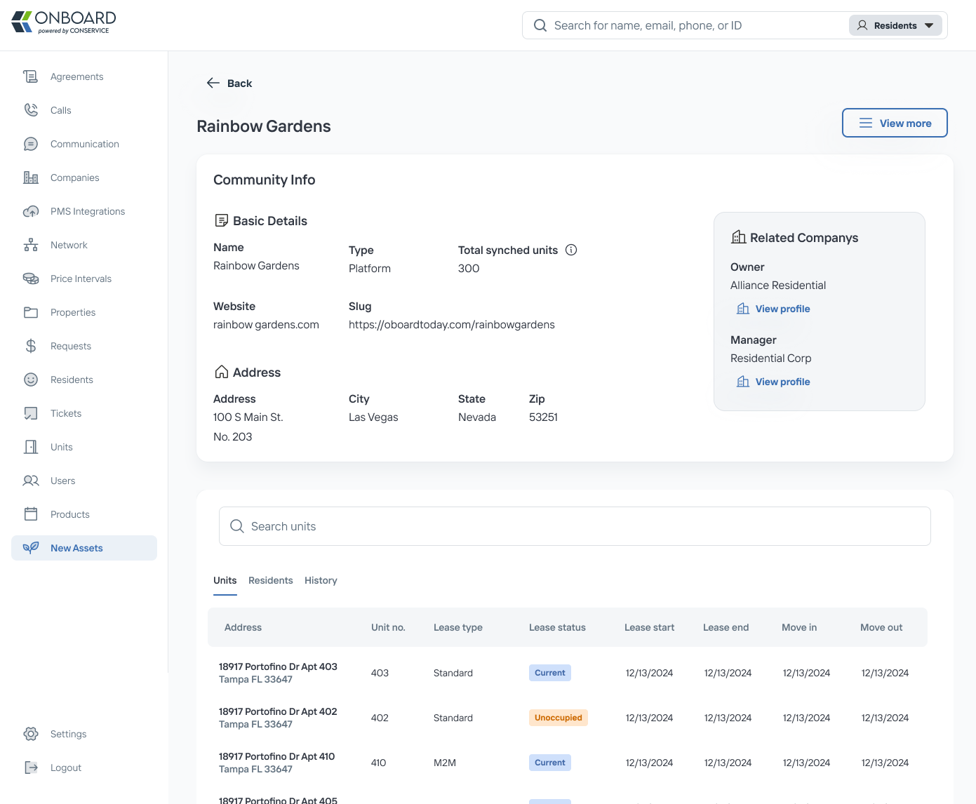
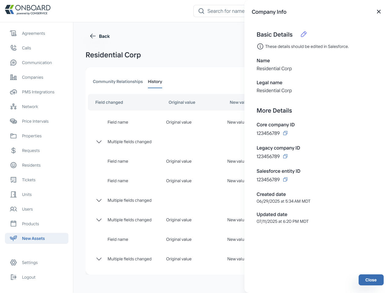
Company profile page
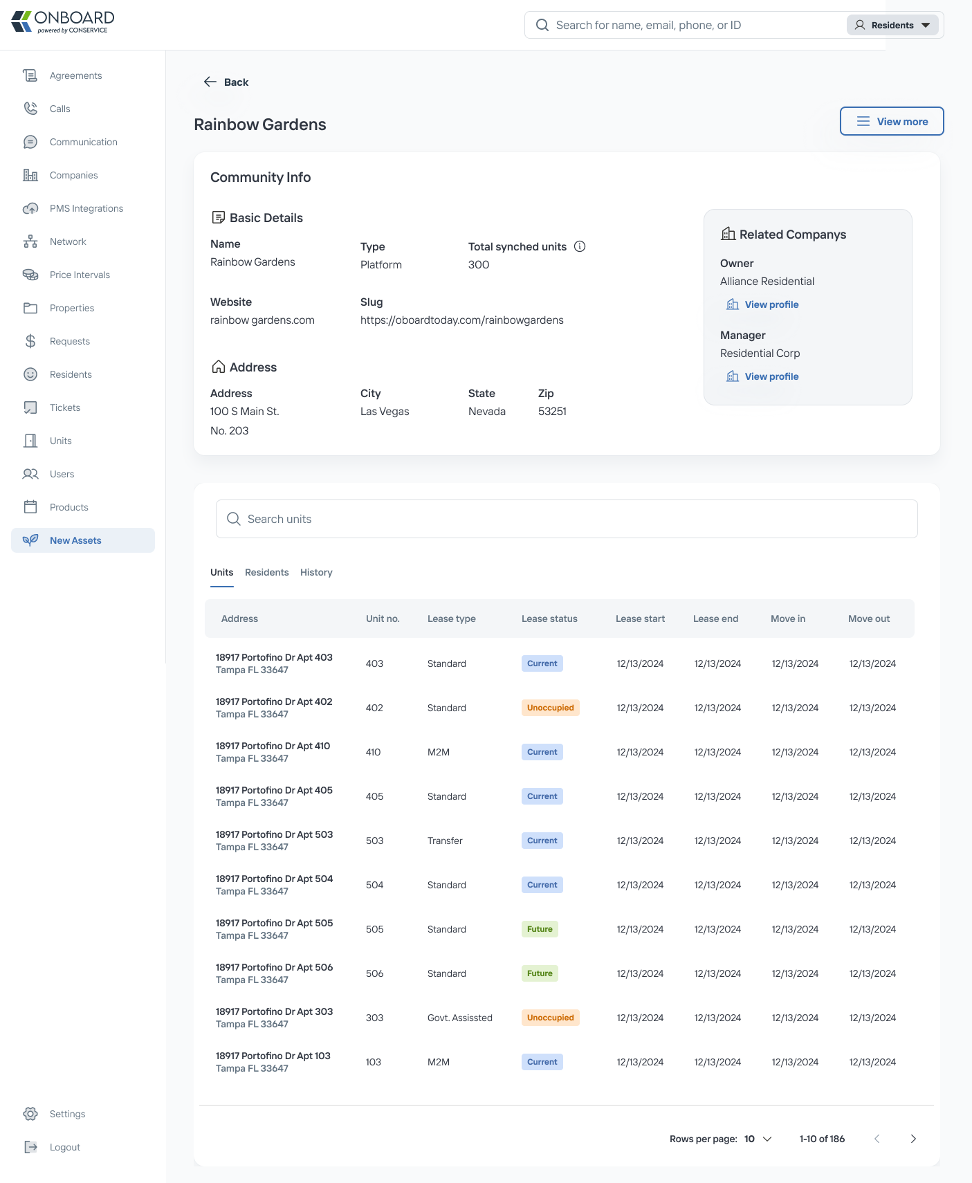
Community profile page
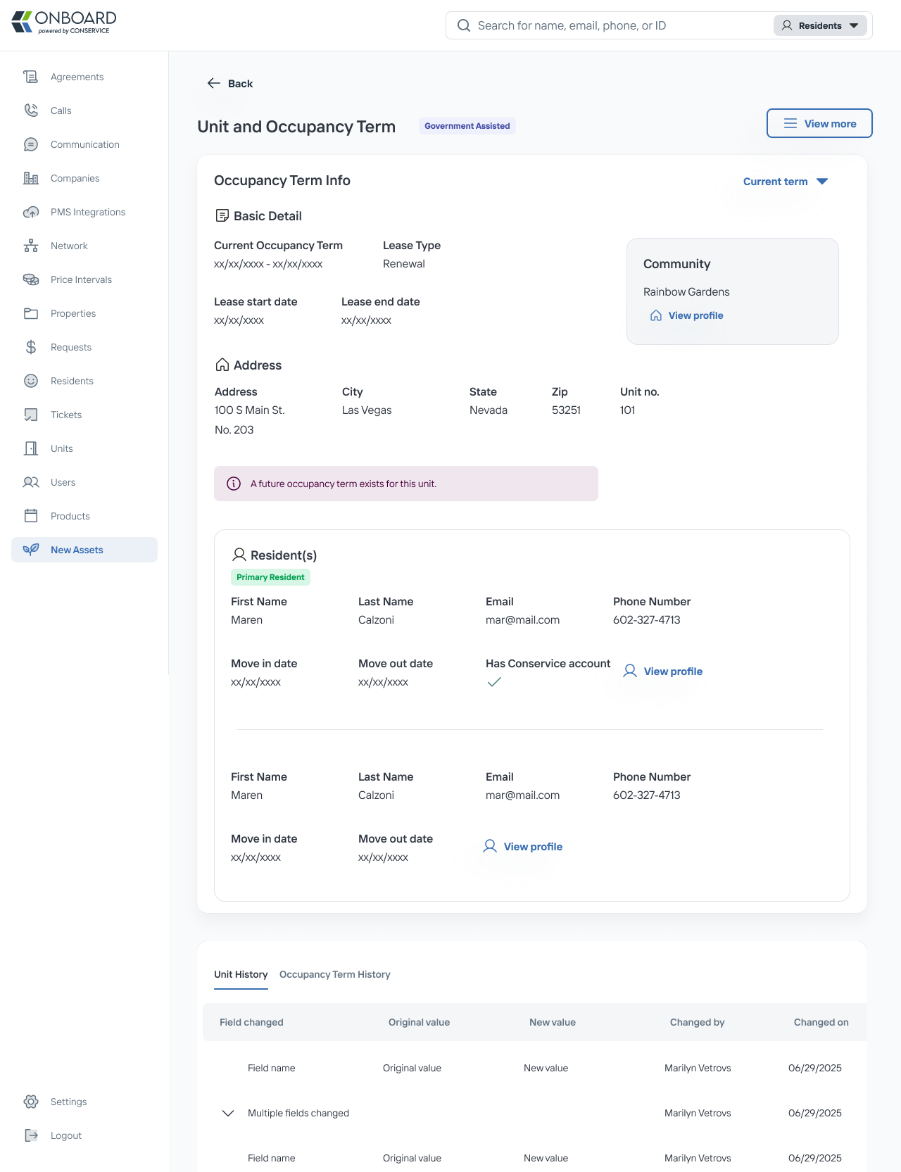
Unit and Occupancy Page
Landing Page with a Global Search
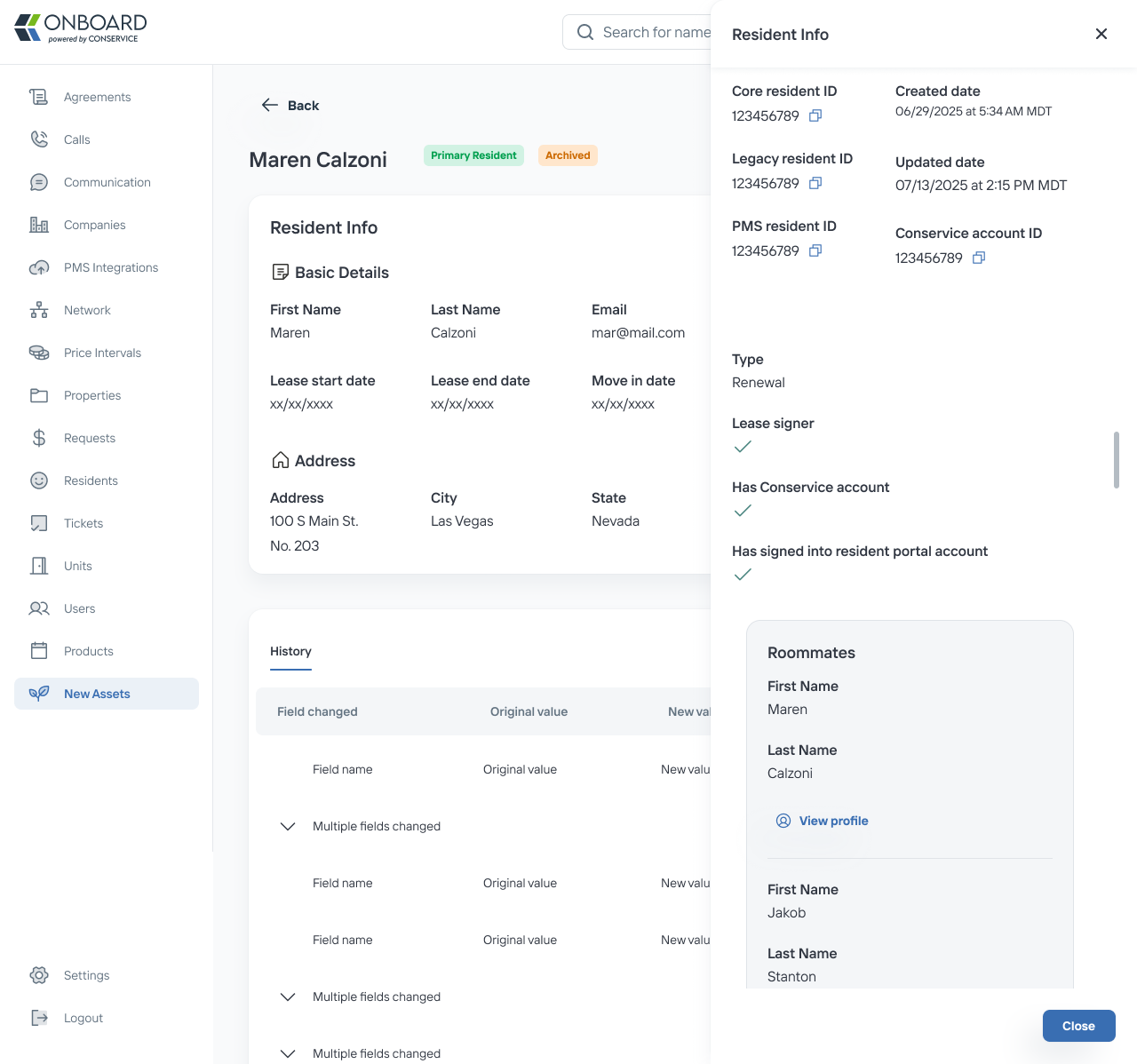
Resident Profile Page
Freeing Up the Operation Team’s Schedule
Complex Systems
Collaboration
Previous project
Conservice
Making Something Out of Some Things
Design Systems
Leadership
Conservice
Next Project
Niccole Mumford
Milwaukee + Remote Designer