
Making Something Out of Some Things
Creating a design system that encompassed where Onboard has been and where it’s going with Conservice as it’s new home.
Team
Project Manager, UX Designer
Role
UX Designer
Project Length
10 months
Onboard’s design system was a conglomerate of multiple design systems. There was a lack of coordination between the UX team and developers, leading to confusion and misalignment during development. Furthermore, Onboard’s recent acquisition would require the new design system to comply with Conservice’s branding guidelines.
Why?
What happens if each chef in a restaurant is using different versions of recipes and ingredients sourced from multiple places? The restaurant patrons will be served a wide variety of meals with little to no consistency. This is the condition of “meals” Onboard was serving to it’s patrons when I joined.
The product development team at Onboard had to be scrappy and move quick, but that left the design system to be neglected - a hodge podge of design systems and one off designs.
I wanted to create one design system, one source of truth, so designers and developers could work more efficiently while building a cohesive and refreshed product.
Perfect Timing
I originally set out on this design systems journey with the intention to build a consolidated system as I had time. But then Onboard was acquired by Conservice and it became serendipitous that I’d started on this project. Along with building a design system for prod dev, it would also need to adopt Conservice’s branding guildelines to apease the business needs.
My Goal
Onboard’s apps had been built using some MUI components and some custom components. The previous designers had been pulling components from 2 different design systems built in Figma (and I discovered a third that was being used!). They also made designs without components, using custom designs or MUI components that existed in the developer’s component library but not in the Figma design libraries. This led to inconsistencies and confusion between the designers.
I would be building the new system in Figma for designers to use. I also wanted the library to built out in Storybook so our developers could also take advantage of a singular design system that was aligned with our Figma library.
The new design system library accomplished the following:
Included updated styles and branding that incorporated Conservice’s branding guidelines.
Onboard “Before”
OG Onboard branding
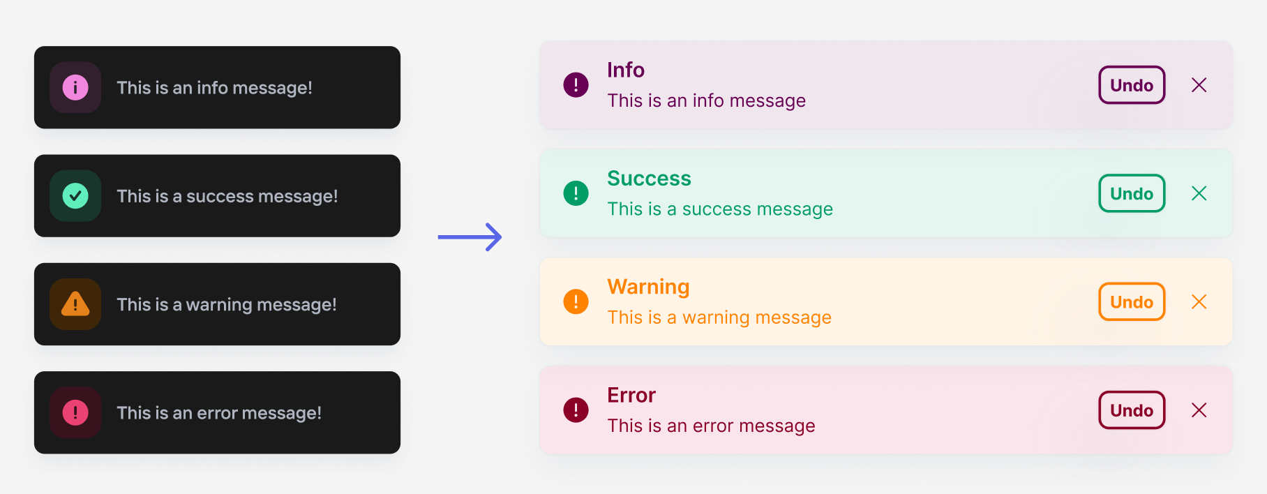
Onboard’s original branding used some “dark mode” elements offset with vibrant oranges and maroons. While I liked the individuality, it wouldn’t mesh well with Conservice’s branding guidelines.

Is This an Error?
The original branding colors didn’t always translate well in the web app. During my discovery process I learned that some internal users often mistook the dark oranges and maroons as errors. This is something I wanted to steer away from.
Accessibility Concerns
Sometimes the orange didn’t feel accessible. Sometimes the orange-redish color
After: Onboard Powered By Conservice
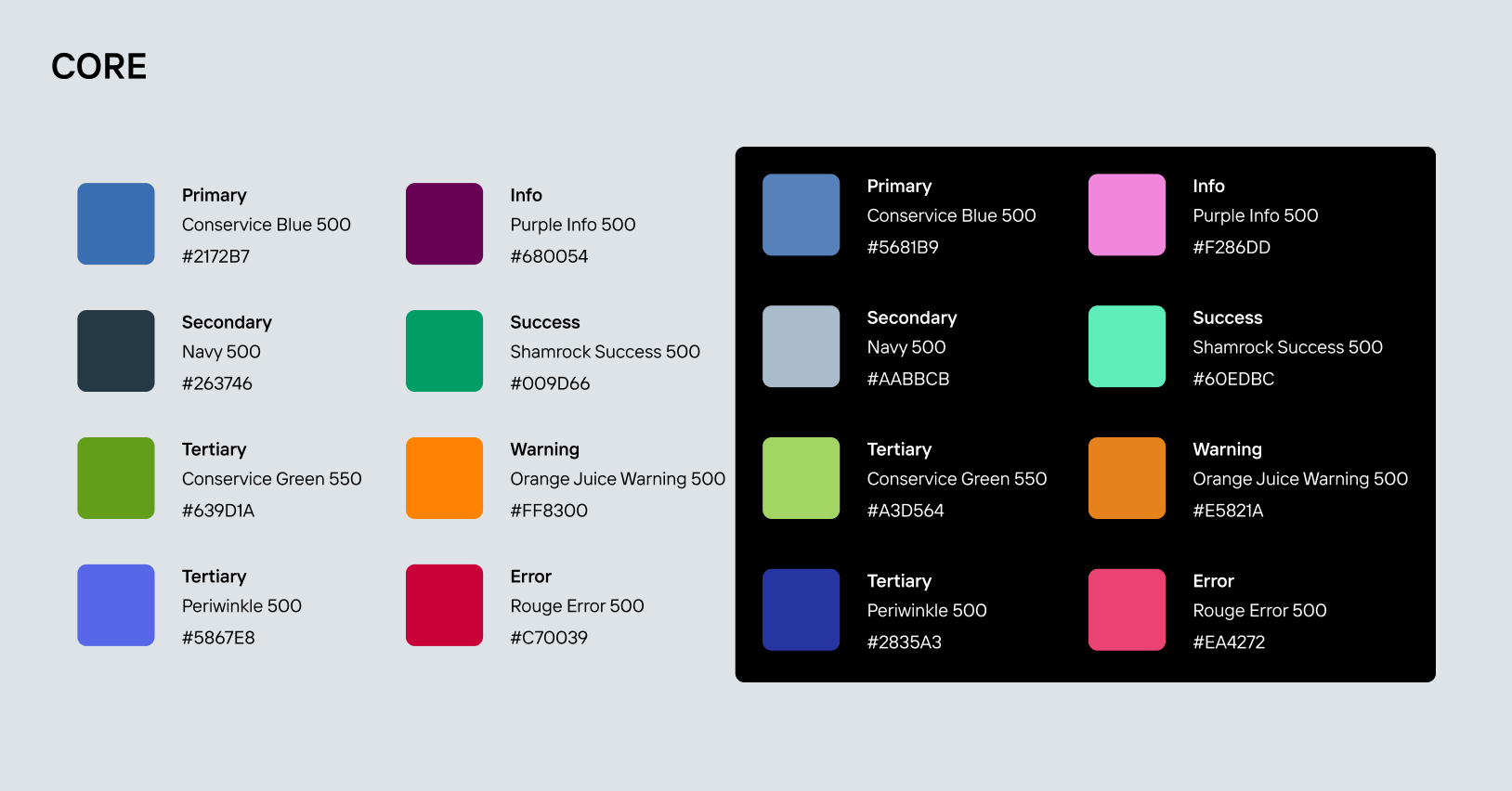
Conservice branding employs three primary colors, a light blue, bright lime, and a dark navy. I chose to use their light blue as our primary color because the lime didn’t meet accessibility standards and the navy didn’t stand out enough next to normal text colors.

Because the Conservice lime green didn’t meet accessibility standards I chose a darker, more accessible shade of it as a tertiary color.
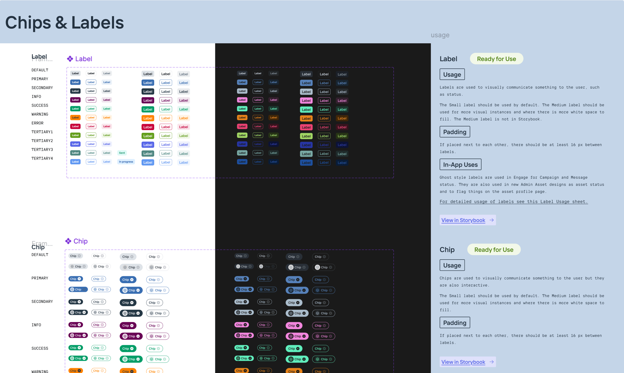
Components
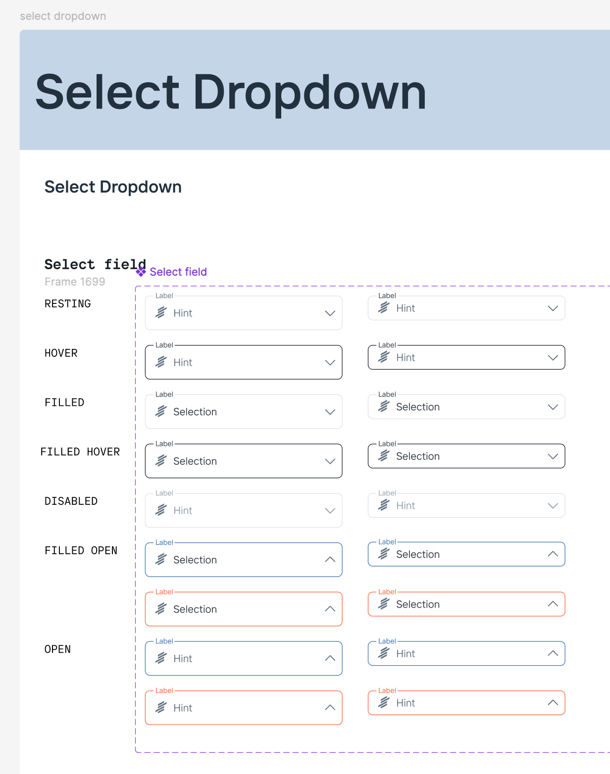
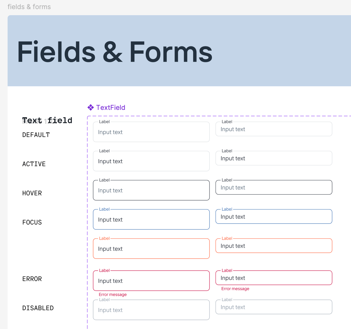
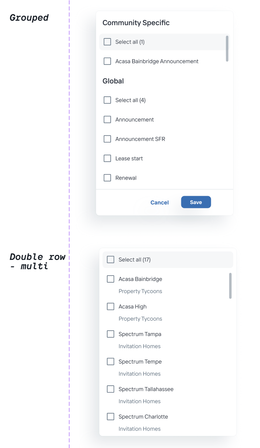
Just like a restaurant kitchen staff needs standard ingredients and recipes, so did the developers and designers I worked with. 32 components and countless variables later, we had a design system library that would help designers and developers design and build a consistent and seamless web applications.
The new design system library addressed the following:
Included MUI components used in the live apps but not present in previous Figma design libraries
Included custom components used in the live apps but not present in previous Figma design libraries

Included MUI and custom components used in the live apps and also built out in previous Figma design libraries
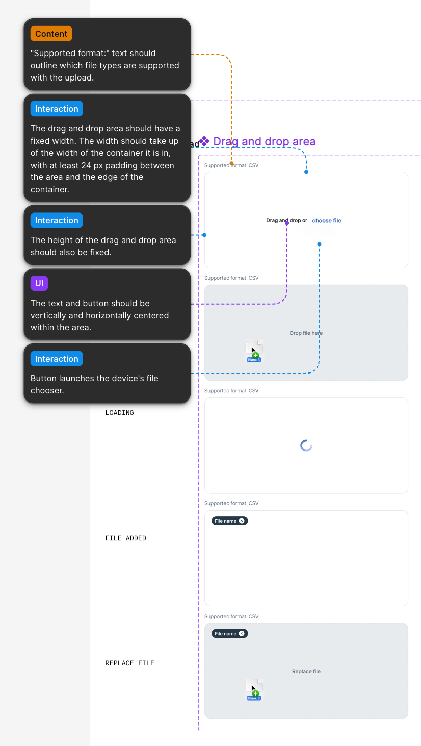
Included patterns and designs used in the live app not yet component-ized in the live apps nor in the Figma design library. Documenting these patters and designs also helped our developers build out the components in their library and in Storybook.
Made changes to components that were no longer working for us.
Designed and built components to fill gaps in our product.
Well Aligned
After building out a single file design system the UX team was able to rid inconcistencies in our designs.
I worked with two developers on my team to do an audit of components in the new design system and what needed to be added to Storybook. After coordinating with engineering managers, I was able to set up recurring meetings with the front end chapter to introduce them to the new design system. From there we were able to have productive conversations about the design system. The improved design system and these meetings calmed the concerns the developers were having and helped all of us to feel like we were aligned.
Internal App Makeover
Information Architecture
User Testing
Conservice

Previous
Niccole Mumford
Milwaukee + Remote Designer
Making Something Out of Some Things
Creating a design system that encompassed where Onboard has been and where it’s going with Conservice as it’s new home.
Team
UX Designer
Role
UX Designer
Project Length
10 months
Onboard’s design system was a conglomerate of multiple design systems. There was a lack of coordination between the UX team and developers, leading to confusion and misalignment during development. Furthermore, Onboard’s recent acquisition would require the new design system to comply with Conservice’s branding guidelines.
Why?
What happens if each chef in a restaurant is using different versions of recipes and ingredients sourced from multiple places? The restaurant patrons will be served a wide variety of meals with little to no consistency. This is the condition of “meals” Onboard was serving to it’s patrons when I joined.
The product development team at Onboard had to be scrappy and move quick, but that left the design system to be neglected - a hodge podge of design systems and one off designs.
I wanted to create one design system, one source of truth, so designers and developers could work more efficiently while building a cohesive and refreshed product.
Perfect Timing
I originally set out on this design systems journey with the intention to build a consolidated system as I had time. But then Onboard was acquired by Conservice and it became serendipitous that I’d started on this project. Along with building a design system for product development, it would also need to adopt Conservice’s branding guidelines to meet the business needs and it would need to be done within a few months.
My Goal
Onboard’s apps had been built using some MUI components and some custom components. The previous designers had been pulling components from 2 different design systems built in Figma (and I discovered a third that was being used!). They also made designs without components, using custom designs or MUI components that existed in the developer’s component library but not in the Figma design libraries. This led to inconsistencies and confusion between the designers.
I would be building the new system in Figma for designers to use. I also wanted the library to built out in Storybook so our developers could also take advantage of a singular design system that was aligned with our Figma library.
The new design system library accomplished the following:
Included updated styles and branding that incorporated Conservice’s branding guidelines.
Onboard Before
OG Onboard branding
Onboard’s original branding used some “dark mode” elements offset with vibrant oranges and maroons. While I liked the individuality, it wouldn’t mesh well with Conservice’s branding guidelines.
Is This an Error?
The original branding colors didn’t always translate well in the web app. During my discovery process I learned that some internal users often mistook the dark oranges and maroons as errors. This is something I wanted to steer away from.
Accessibility Concerns
Sometimes the orange didn’t feel accessible. Whatever our new primary color would be, I wanted to insure it would meet accessibility guidelines.
After: Onboard Powered By Conservice
Conservice
Conservice branding employs three primary colors, a light blue, bright lime, and a dark navy. I chose to use their light blue as our primary color because the lime didn’t meet accessibility standards and the navy didn’t stand out enough next to normal text colors.
Conservice
Because the Conservice lime green didn’t meet accessibility standards I chose a darker, more accessible shade of it as a tertiary color.
Components
Just like a restaurant kitchen staff needs standard ingredients and recipes, so did the developers and designers I worked with. 32 components and countless variables later, we had a design system library that would help designers and developers design and build a consistent and seamless web applications.
The new design system library addressed the following:
Included MUI components used in the live apps but not present in previous Figma design libraries
Included custom components used in the live apps but not present in previous Figma design libraries
Included MUI and custom components used in the live apps and also built out in previous Figma design libraries
Included patterns and designs used in the live app not yet component-ized in the live apps nor in the Figma design library. Documenting these patters and designs also helped our developers build out the components in their library and in Storybook.
Made changes to components that were no longer working for us.
Designed and built components to fill gaps in our product.
Well Aligned
After building out a single file design system the UX team was able to rid our designs of inconsistencies. The improved design system also fostered continuous conversations about how we wanted components to function and goals we had for the design system.
I worked with two developers on my team to do an audit of components in the new design system and what needed to be added to Storybook. After coordinating with engineering managers, I was able to set up recurring meetings with the front end chapter to introduce them to the new design system. From there we were able to have productive conversations about the design system. The improved design system and these meetings calmed the concerns the developers were having and helped all of us to feel like we were aligned.
Internal App Makeover
Information Architecture
User Testing
Previous project
Conservice
Niccole Mumford
Milwaukee + Remote Designer